I've had quite a few people ask me how I draw the way I do.  I figure if the handful of people who ask me want to know, there are probably more who haven't written but wouldn't mind knowing, so here's basically my drawing manual (formatted to be kind to printers), which really isn't that much different from many others.  And this, as opposed to email, has the benefit of coming with illustrations!
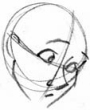
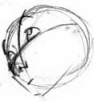
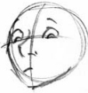
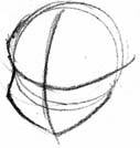
 

THE FACE


       Always start with a circle.  This represents the head, which is the most important part of your drawing.  It doesn't have to be a perfect circle (but it helps to get as close as possible, of course) and can be very sketchy.  This is just to cement the location of the head on your paper.


       Draw a curved, horizontal line across your circle.  This is your eye line, the line on which the eyes of your character will rest.  Depending on the character, it can be in different places; I usually find I put mine about 3/4 of the way down the circle but I know I need more variety in my character design.  If you want to have some fun, you can vary it a lot and see what effects you get.  Generally, the lower you put the eyes in the face, the younger the character looks.
       It's curved to give the illusion of depth.  Suddenly your circle is a sphere, and the line shows how it curves.  Keep telling yourself your drawing is three-dimensional, don't let the flat paper throw you off.
       You don't have to draw it perfectly level - tilting it is the best (only) way to depict a tilted head. 


       Next, draw a vertical line that is at a right angle to the eye line.  This gives you the idea of where the center of the face is.  It's very important to keep the features placed in the same place on either side of the line ... unless you're drawing someone with an extremely odd face, that is.  But the most important thing is to keep it at a right angle to your eye line, or else your face will look all wonky.  This line is also sometimes curved, especially if your character has a receding chin or slanted forehead.  Feel free to play with the shape of this center line, have it curve drastically, have it almost straight, give it a sharp angle – it's a great way to explore characters.


    With these crosshairs of the face, you can make the head circle look like it's facing any direction.  This grid is also your roadmap to being able to draw the same character in different poses, because you'll be able to plop down the features at pre-arranged places according to how far they are from the center lines.

From here forward, the order in which you do these steps is entirely up to you.

Draw in the contour of the face, remembering the eye socket, flesh for the cheeks, the chin, etc.
Draw in the nose and ear.  I like to draw the nose first to cement the centre of the face and the perspective in which I'm working, as well as the shape of the eye sockets.
Draw in the rest of the features.  In real life, the eyes are usually one eye width apart and the mouth is halfway between the nose and the chin, but these are cartoon characters, so they don't have to obey the rules.  It's good to know them anyway, though.
Sketch in the general shape of the hair, paying attention to the way it parts and the volume of each section.

Add texture to the hair, especially where the line changes direction.  Don't make the tufts of hair zigzag in a sawtooth pattern, make random shapes and sizes, which makes it look more realistic and interesting.


ATTACHING THE HEAD TO THE BODY

Here's a very anatomical drawing of the neck, from the front. Actually, to be really accurate, the neck is usually as wide as the head - this sounds weird but it's true.  For cartoons, though, it usually looks better to have a thinner neck (unless the character needs a fat one).  Notice that the neck is almost like a cylinder, its sides are parallel until they widen into the shoulders at the bottom.  The collarbones are illustrated at the bottom, the diagonal lines running up the neck are the sternocleidomastoid muscles which run from the inside of the collarbone to behind the ear.  You don't have to draw these, but it's a good idea to know they're there. 
Here's the head, neck, and shoulders in profile.  Notice how the neck is attached more towards the back of the head than the front.  The back of the neck is the spine, which attaches to the back of the skull, all that's in front are the tubes and muscles that allow you to eat, breathe, and look at the clouds.  The shoulders look like they face slightly forward.  The back has a slight outward curve after the neck attaches to it.


THE UPPER BODY

This is a simplified drawing of the ribcage, in its actual form.  This is rather complicated and not usually necesary to draw on your character (as long as they're wearing a shirt or are in good health), so we simplify it to this:
It's kind of like the head, except in this case the horizontal line connects where the shoulders should go, and usually follows the approximate line of the collarbones.  To tilt the shoulders – guess what? – you tilt the line.  You can draw little balls on the ends of the line if you want, to keep the mass of the shoulders if you feel like you're having trouble with it.  Make sure it stays slightly stretched out vertically, not a perfect sphere like the head.
Here is the torso in profile, so you can see the way the spine curves.  This is how it looks when someone is standing or sitting up, it can bend all sorts of different ways for different actions.  It's important that you keep a space (a good space, but realistic) between the ribcage and the hips (another circle).  

Here are the very simplified shapes of a man and a woman, for depiction of the differences thereof. (These are both adults - children are much more similar to each other.)  A man has wider shoulders and they are more level, while his hips are narrow.  A woman, on the other hand, generally has more narrow, sloping shoulders, and wide hips.
Here are some quickly sketched arms, showing the deltoid muscle of the shoulder (which is nice to keep in mind, even with sleeves) and the handy way of indicating the elbow even when the arm is straight, by showing the slight bulge, just below the joint, of the muscles of the lower arm.  When the arm is bent, these muscles stay in place and appear more towards the elbow than the wrist.  Remember to keep the elbow sharp!

To see how the arm connects to the body, see the drapery model below.


THE LOWER BODY

Here is the right leg of a character.  The upper leg is longer than the lower, and has more volume.  The calf muscle is lower on the inside than the outside, which is the opposite with the ankle.  A good way to figure out how the leg attaches to the body is to think of a swimsuit or underwear.  We all wear underwear (I hope) and chances are, you've seen yourself wearing it, so try to remember what it looked like.  
 

HANDS 

First off, let me just say that it's perfectly okay to have a hard time with hands. They take a lot of practice and observation to get right.

Here's an easy trick that can help in some circumstances - draw a square (the fact that this one looks more like a rectangle is beside the point) and then draw five lines sticking out of it: the thumb comes from the bottom, the other four on top.  The wrist attaches more towards the side of the hand opposite the thumb.  

This shape can be turned around and put in different positions, bending the fingers however you see fit.

When you get a position you like, flesh out the hand.  The fingers just take practice, but the large fleshy part of the thumb is usually delineated, as is the flesh beneath the fingers.
  The single best thing you can do to get better at hands is to draw your own – if you're right-handed, draw your left hand, if you're left handed, vice versa. Do this a LOT. The more you do it, the better you'll get.  You'd be amazed how many positions you can draw your hand in while it's still attached to your body. 
 

DRAPERY


Here's a napkin hanging on a clothesline.  Pretty boring, right? Here's the same napkin, with wrinkles added.  The wrinkles show where the stresses are in the fabric, in this case the tension between the points where it's attached and gravity.
Let's start with an unclothed figure, which I have made female for reasons discussed below. She's wearing a simple dress, with one sleeve rolled up just for demonstration.  The skirt is gathered at the waist, so there are gathering lines showing the folds of the fabric.  Because there's more fabric in the skirt than the circumference of the waist, it waves back and forth at the bottom, too.  
Here's the same dress in a strong wind.  You still keep the gather lines in the skirt, but they're slanted away from the wind.  The only things stopping the skirt from flying away are her legs, so it's pressed up against them.  The skirt is not stretched to its full extent yet so there are still waves in the bottom – though they reflect the way the wind is blowing, too, and show that they are influenced by being attached at the waist.  The loose sleeve obeys the same rule as the skirt, though on a smaller scale.  

Beware this error!  While it's admirable that you know how female anatomy works, you don't get this effect in clothing unless you're wearing rubber clothing.  It looks much better to put your brain to work and think of how cloth would drape over it. 
Here's an elbow.  A common, everyday elbow.  Now let's clothe it.
Here's the same elbow with a loose sleeve.  Most of the gathering happens at the actual bent part of the elbow.  The cloth on top hangs down and overlaps it a bit.  That nifty swoopy line is a very nice way to depict folded cloth because it actually look like that, more or less.  A tight sleeve has shorter wrinkles, but no matter ho long the sleeve they never extend to the opposite side.

GENERAL TIPS

1.  One of the very best things you can do to improve your drawing is to draw from life, which means actually drawing what you see in front of you.  Whether it's your mom or a fork, the better you get at accurately drawing what you see, the easier it will be to transfer the image in your head to the paper in front of you.  This is also really good if you aren't sure how to draw something from memory - say you needed to draw a light bulb but weren't sure exactly how all the little inside wires worked - find a light bulb and draw it, paying attention to what you don't know, and chances are next time you need to draw one, you'll have it there in that mental library.  If not, try again.  It just takes practice. 

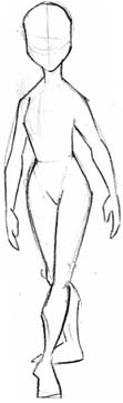
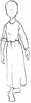
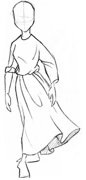
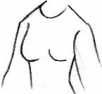
2.  To take drawing from life further, draw people.  Lots of people.  Draw your family, making sure to get facial features right.  Take some paper (preferably in a sketchbook, it's easier) to a mall, park, or airport, or somewhere with lots of people, and draw them.  If you feel insecure about this, find an inconspicuous corner and draw people who aren't facing you.  But drawing people is the best way to learn to draw quickly and accurately (because they usually don't hold still for very long), and get an idea for the variations that set people apart from each other.  This will also give you an idea of how cloth works in the way it folds over joints or the way a dress folds, which is important if you plan on drawing characters that aren't wearing skin-tight clothes or ... nothing at all.

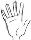
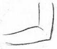
3.  I repeat, draw your own hands.  I, personally, did most of this during my math classes, but I don't recommend you do the same.  Just do it sometime when you are supposed to have the time.  You can get many, many, many different angles on your hands in all sorts of interesting positions.  Learn the way fingers bend, where the thick parts of the palm are, the curve of the knuckles, how your thumb works, etc.  And draw them a LOT, no matter how painful it is at first – in fact, if it's really painful, you need to draw them more.  It'll probably be very hard at first but it's very important that you learn to draw hands.

4.  Look at the work of other artists and see how they do their thing.  Animators are exceptional artists, and they probably draw more than any other people on the planet, so looking at their rough sketches (this does NOT mean colouring books, this means "The Art Of [insert animated movie here]" books, which you can usually find at a library) can be really educational.  If you have access to a DVD player, rent (or buy, if you're really serious about it) the special editions of Tarzan and Emperor's New Groove, and look at the rough animation - go frame by frame and see how they use structure and rough sketches before putting on details.

5.  Draw in pencil.  If you draw in pencil now, great.  If not, start.  Pencil is great not because you can erase it (though sometimes that helps, as long as you don't get carried away) but because you can start with a really light sketch and get darker to delineate the lines you want to use, while keeping everything nice and lively.

6.  Learn to draw pre-existing cartoon characters.  Trace them or copy them at first to get a general idea of how to draw them, then try deconstructing them using the steps above so that you have a road map for their features.  Learn to draw them so they look like they're supposed to (or, in animation terms, on model) without looking at reference.  Learn characters from different styles and with different features – if you learn to draw Jane from Tarzan, don't move on next to Meg from Hercules, they're too similar.  This will give you a nice mental library of ways to draw facial features that you can recombine in your own mind.

7.  Develop your own personal style.  Everyone has their own style of drawing, just like everyone has unique handwriting.  Don't try to make your style exactly like another's just because it's cool.  It's great to be influenced by different styles, and learning how to draw them is great exercise, but you'll probably not be as good in a foreign style as your own.  

8.  Check out some cartooning books to learn how to use action lines and make a good silhouette.  I could discuss them here, but I couldn't do it half as well as most cartooning books.  The library usually has several.

9.  Remember that all of this takes loads of practice.  Scads of practice.  Oodles of practice.  The great artists didn't get that way by doodling while they were talking on the phone, they devoted their life to learning to draw just right.


RECOMMENDED BOOKS

The Illusion of Life by Frank Thomas and Ollie Johnston
Really, this is the animator's bible. Anything you want to know about animation (and maybe some things you didn't want to know) is in this book.  Not only that, it has loads and loads of rough drawings that are more than enough to keep an artist happy for weeks.

How To Animate Film Cartoons by Preston Blair
This is part of the Walter Foster how-to-draw series, and illustrates basic construction and design principles much better than I can.  It's also got lots of useful animation basics if that's what you're interested in doing. It's the book that most of the people in the industry today learned from.

Creating Characters with Personality by Tom Bancroft
This is a great book for anyone who's curious about character design – it goes really in-depth into construction, different shapes to use for different sorts of characters, dynamic poses, different styles, and basically everything you need to know to get going on your own art. As well as Mr Bancroft's own observations, he gets several other well-respected character designers to chip in with their thoughts.

Action Cartooning and Fantasy Cartooning by Ben Caldwell
Even if you're not interested in Action or Fantasy as subject matter, these books have really clear, really good tutorials on drawing technique, and an author who obviously kicks butt in the drawing department (by which I mean he knows what he's talking about).

Animation Magic by Don Hahn
This book is good for general information on how animation is done, on a simpler and more cursory level.  Don Hahn produced most of the famous Disney movies in the 90s so he obviously knows his stuff.  There are lots of interesting facts and great pictures in this book, plus a glossary of animation terms and - very useful - a whole section on tips for hopeful animators.

The Art of the Hunchback of Notre Dame by Stephen Rebello
This is the book which I practically memorized when I was fourteen.  It has loads of incredible artwork in it, interesting text with quotes from the people who actually made the movie, and some really funny gag sketches in the index.  The art books from other movies are good, too (Hercules's has a lot of animation sketches, for example, and Tarzan's is pretty darn excellent) but Hunchback's is my personal favourite. 

There are many other books out there - go for an adventure at the library and find some of your own! 

Back to the Main Art Page or the Index